Abstract: Repeating the design method of the basic form as one of the creative methods of the logo has been proved in many successful design examples and has a great design space. This article mainly introduces the concept, application characteristics and application form of the repeated basic form, and further deepens the understanding of repeated basic forms through design example analysis.
Keywords: logo design, basic form, repeating basic form
0 Preface
The sign is a kind of mass communication symbol. It expresses certain meanings in a variety of concise images, conveys clear and specific information, and has strong functionality beyond words and words. An excellent logo should have original, clear and beautiful attributes, and its design means should also be diversified.
Repeating the basic shape design method as an effective means of logo design has been widely used in the actual design process. It repeats changes in a single basic form, creates a new and visually powerful art form, and provides a broader and richer design space for the logo.
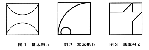
1 Concept of basic form and repeating basic form
The basic form is the basic unit that constitutes the figure. A dot, a square, or a line segment can be used as a basic shape (Figures 1, 2, 3). The basic form is the most basic and fundamental form of the polymorphic design element. In the logo design, in addition to using this form, it cannot be limited to this simple basic element. In a basic unit (such as a 5 × 5cm grid), we can use points, lines, and faces to divide, overlap, and cut out forms to form a basic form of change. The form of this change is more full than a single basic form, and it is easy to form a visually stimulating image.
1) Strive for simplicity
Easy identification is a major principle of logo design, which determines the special requirements for logo design to be concise. The so-called "Jane" means to be concise and eye-catching; the so-called "clean" is to be clear and concise. Concision is not simple. Conciseness as an art rule organizes complex meanings and diversified forms into a unified structure. It organizes complex materials into ordered wholes with as few structural features as possible. It means quantity. Reduced, qualitative increase. For example, triangles are simpler than squares, but their properties are more complicated. The concise image has a strong visual impact. It creates a clear, powerful, fixed and unified impression in people's minds and is easy to identify. The basic form of repetition is itself an iterative arrangement of basic forms. To obtain good visual effects, it is necessary to repeatedly scrutinize the design and arrangement of the basic forms to obtain the most abundant visual effects with the most concise graphics.
Japan's "Mitsubishi" company's logo is very impressive. The “Mitsubishi†logo (Fig. 6) is a basic shape with a positive rhombus as the symbol. It is centered on the apex angle of 60° in the rhombus and rotated at an angle of 120° to form a figure that is entirely contained within a large triangle. It is concise and easy to remember. As long as people see the combination of these three diamonds, they naturally think of Mitsubishi.